
Your website is your storefront, and it can make or break your software business. But here's the thing: most teams get it wrong.
They copy what's trendy, buy templates, or let too many cooks in the kitchen.
The solution is simple. Follow the formula that companies like Slack, Figma, GitHub, and Linear use to achieve great results.
In this post, I'll share my learnings from working on SaaS websites and helping companies create marketing sites that drive results. I've been fortunate enough to have experience building SaaS products as well, which I feel gives me a unique perspective on the subject.
I'm definately not a marketer, but I've picked up a thing or two along the way that I hope can help you avoid some of the mistakes I've made in the past.
Hero
This should summarize your website's purpose and guide visitors to the main call-to-action. This is where you hook your visitors, this is where the magic happens!
The hero section has three parts: a headline, a sub-headline, and a call-to-action.
Think of it as the cover of a book, it's your chance to make a great first impression. Make it bold, make it clear, make it irresistible:
- The title of the book
- Some social proof, such as the credentials of the author, reviews
- A call-to-action - buy the book and read it!
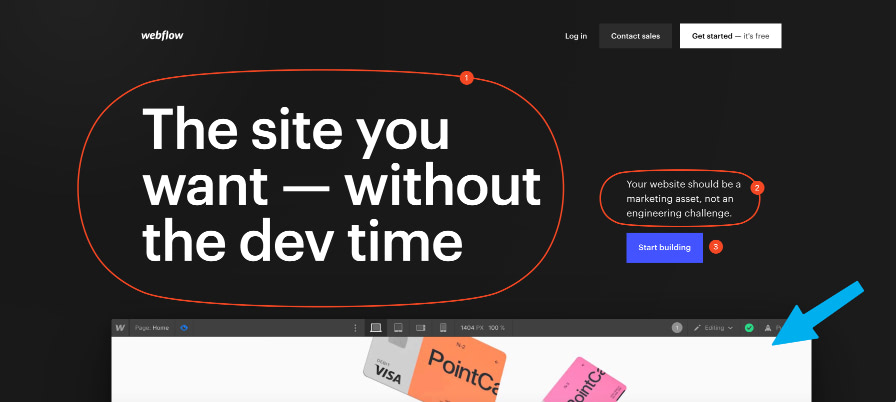
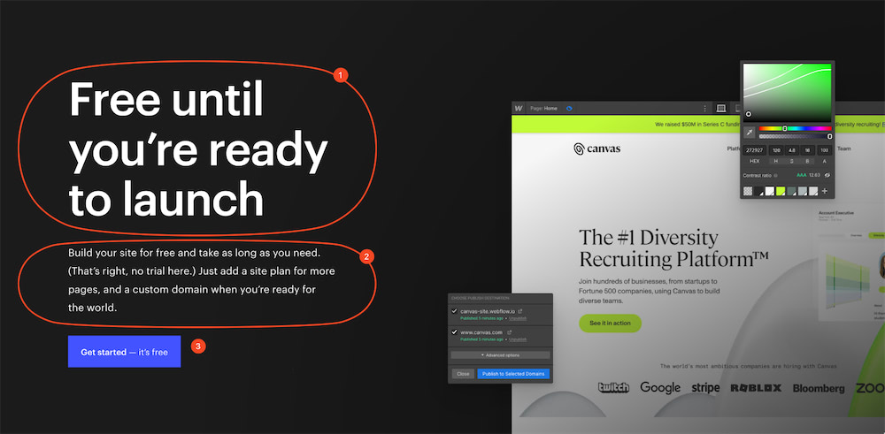
Webflow
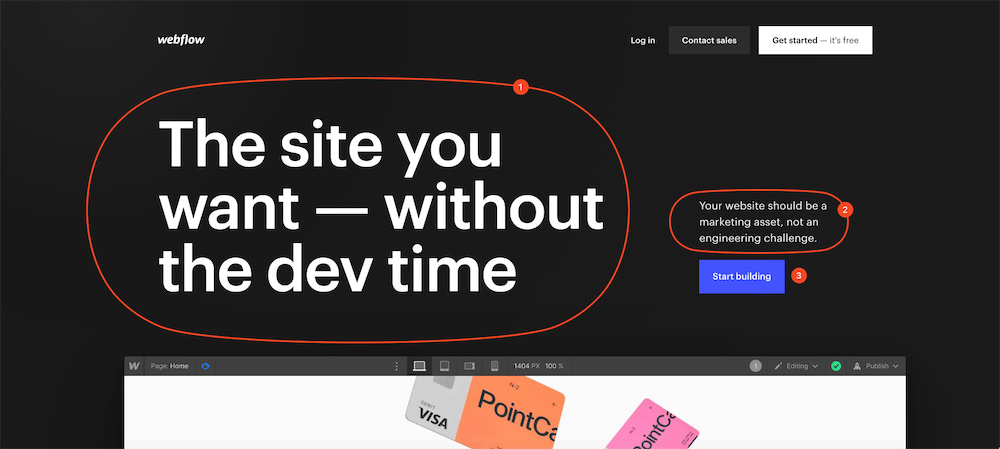
- Heading: This headline is irresistible and promises exactly what a Webflow customer wants
- Sub-heading: Quickly explains the pain that Webflow solves for the customer
- Call-to-action: "Start building" is a clear and action-oriented call-to-action
GitHub
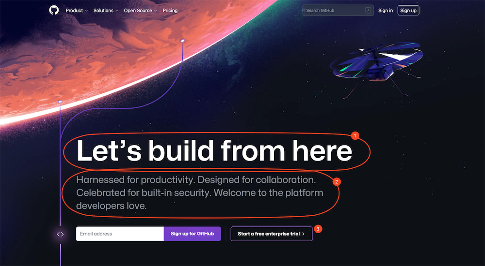
- Heading: Aspirational headline that focuses on product benefit
- Sub-heading: These short punchy sentences have a great rhythm
- Call-to-action: "Sign up for GitHub" via an email form
Figma
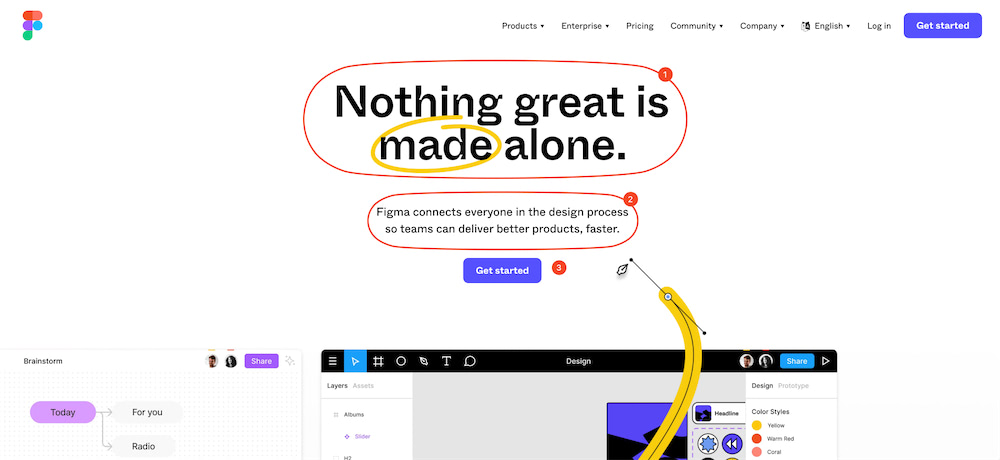
Love this page. They show through animation how Figma works, working as a mini-product demo. But look, same 3 parts!
- Heading: Another aspirational headline that focuses on product benefit
- Sub-heading: Benefit focused sub-heading that makes makes the more abstract headline actionable
- Call-to-action: "Get started" is as simple as it gets
Linear
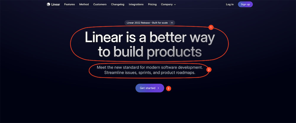
Same 3-part formula as before
- Heading: Vision and benefit focused headline
- Sub-heading: Straight-to-the-point. Love it
- Call-to-action: The classic "get started"
Why do all these great companies do exactly the same thing? Because it works! Do the same, then iterate on these 3 components until you get the results you want.
Some common hero mistakes include:
- Loading time: Imagine you are browsing a book store and one book takes 5 seconds to load the front cover. You’d move on. Same with your website. Speed is not just a feature, it's a requirement
- Big CTA: Don't ask for too much. Think of your CTA as an 'investment' from the visitor. The lower the investment, the higher the conversion. Respect their time and attention by keeping it simple and clear. Offer a free trial or no-commitment option to reduce risk
- We need multiple main CTAs: Close this web page and go figure it out. Pick one!
Teaser
See how we see just a little of a graphic on the Webflow example?
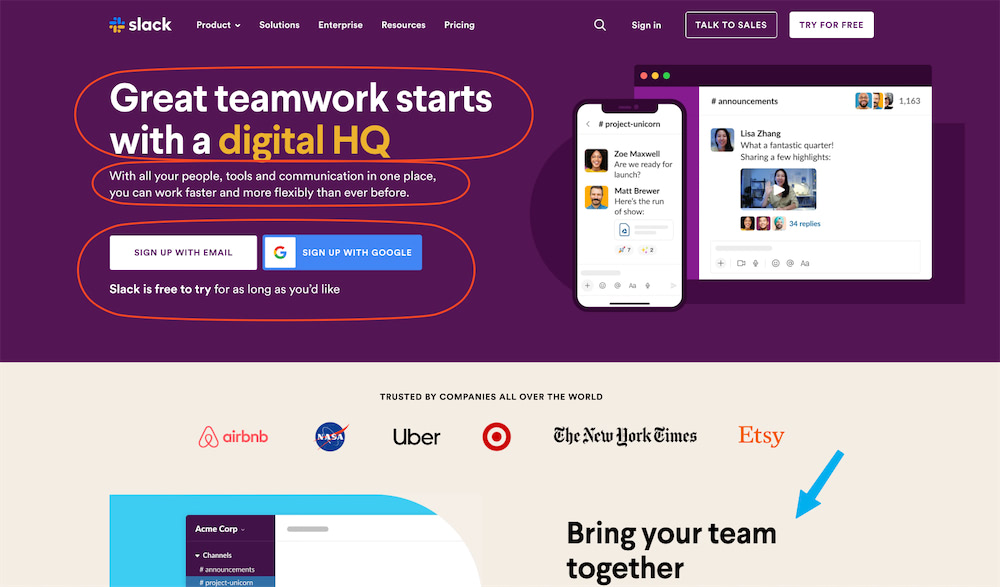
Or how Slack teases their first feature section?
This encourages the user to scroll past the hero and start writing about all the benefits of your product.
You could also just show a 'scroll down' arrow... but use this as a chance to be creative!
Features
This is the meat of the landing page sandwich.
This section is all about your customer - not you. Forget about your features, focus on the customer's pain points and show them how your software is the solution. Make it easy for them to understand the value you provide:
- Jargon-free zone: Save the buzzwords for LinkedIn. When you need to explain a feature, avoid jargon. This includes ’shared language’ in your team, which might not be intuitive. Try writing your copy from the perspective of the user. What benefit do they get from this feature, and why would they want to pay for it?
- Visuals as mini-demos: Visuals should feel like the user is already using your app. Show them using the feature and how simple it is. This reduces signup anxiety and increases product familiarity before they even try it.
- Explainer videos: If you choose to include an explainer video, keep it less than 2 minutes long.
Reassurance
Want to give your visitors the confidence they need to become customers? Share the love. Show real-life examples of how your software has helped other businesses through customer testimonials and case studies. This is the time to build trust and showcase the value you provide.
Some quick tips:
- Who is this NOT for: Consider having a section that explains who your product won't work for. This vulnerability helps the lead build trust with you and disqualifies customers that are a 'bad fit' and would likely churn
- Reduce risk: Consider offering a free trial, no-commitment option or refund policy to reduce risk
- Be real: Share details of your team and your approximate geographical location, particularly if you are based in the same country as your target customer. Sadly, some anonymous looking online businesses are unscrupulous, so share a few personal details to build trust
- Cut the crap: Any smell on your website will scare users away. Make sure testimonials are real and ratings are balanced. If all your customers are stock photo models, this also looks suspicious!
Pricing
Make sure pricing is easy to find, and consider including a dedicated "compare plans" page.
However, if your company is just starting out or if you're still testing different pricing models, you may not yet have firm pricing to share. In this case, there are a few options you can consider:
- If you are 'early-access' and plan to charge later, say that. "Free during beta" will help you attract great pilot customers, and disqualify customers who are looking for a more mature product.
- If you are 'sales demo' and price on demand, provide a rough price, and make it clear that the final cost will depend on the specific needs of the customer
- Another situation? Include a contact form where potential customers can reach out to request more information on pricing
Just be honest about your pricing situation and make it easy for potential customers to get in touch with you for more information.
Pre-Footer
The pre-footer is your last chance to convert visitors into customers. It's the last thing they see before they leave, and it's your last chance to make an impression. So, make the most of it.
The goals are the same as the hero - it tells the visitor exactly what you want them to do and drives them towards it.
Webflow follows the same three step formula as their hero, but focuses on reassuring a visitor who has already read the whole page:
Slack has two pre-footer sections, one of those who need more information and one of those who are ready to go:
Summary
- The hero section is the first thing visitors see and should summarise what your website is about and drive them towards your main call-to-action. It should have three parts: a headline, a sub-headline and a call-to-action.
- Tease the main body part of the page in the hero
- Forget about your features, focus on the customer's pain points and show them how your software is the solution. Use visuals as mini-demos and avoid jargon
- Share real-life examples of how your software has helped others through customer testimonials and case studies
- The pre-footer is often forgotten, but is your last chance to make an impression. Treat it like another hero!
Thanks for Reading!
I always appreciate feedback or suggestions for future blog posts. You can find me on LinkedIn or if you want to improve the article to help future readers, please feel free to submit a PR.